Wednesday, June 29, 2011

Movement and Motion


Motion is a powerful element of physical design that can be conveyed even though there might not be any actual movement taking place within an image. In this World of Warcraft image depicting a paladin hero striking an undead creature, motion is conveyed through a combination of various visual queues. The hero's posture puts all his weight into his sword arm giving the viewer an idea of the force behind the strike. The splatter of blood also enhances the viewers idea of force behind the motion. The way the blood is depicted is another example of how motion can be depicted. Anytime something defies the laws of physics (such as the drops of blood moving upwards instead of sitting in a puddle) our mind perceives the image as something in the process of moving. The blurring of the hero's sword is another example of motion in the image. It's an example of temporal aliasing and gives the sword the illusion of great speed.


This image from the game Mirror's Edge portrays motion in another way. The viewer assumes the role of the character and motion is portrayed in this image through the manipulation of the viewers sense of vision. The blurring and stretching of the environment around the character gives the whole image a great sense of motion. The blurring and stretching is strongest away from the focus of the image, which gives the piece a very strong sense of forward movement. Like the blood from the previous image, defying gravity plays a big role in this images sense of motion. The characters foot is seen at the bottom of the scene, floating in mid air. Our mind tends to want to plant everything on a stable surface, and if something isn't physically stable, it's on its way there through motion. 

Original Images can be found here:
http://mr--jack.deviantart.com/art/Vindictive-Strike-204828889?q=boost%3Apopular%20in%3Adigitalart%2Fpaintings%2Ffantasy%20action&qo=50

http://resetglitch.wordpress.com/category/features/page/2/

Monday, June 27, 2011

Tone and Color


Tone and color are important elements of visual design that create dimension and draw attention. Both are essential elements of this Assassin's Creed II poster. Tone is used in the poster to give a strong sense of light and darkness. It separates the focus from its background by creating contrast. The tone of the piece gives the feeling of blindingly bright light as well as dramatic shadows. Tone also gives the image dimension. The tonal differences of the character's clothing creates dimension and helps our brain separate the character from the white background even though his clothes are essentially the same color as the white background. It creates both real and imaginary lines that are perceived by the viewer. Color is also an important element of this piece. The use of a limited color palette really makes certain colors stand out and creates tension that draws the viewers attention to the piece. Red and white are two colors that dominate this image because they are the game's signature colors. The red and white outfit defined the character of the first game, and the red and white color of this poster symbolizes the continuation of the first character's legacy. Texture is used to separate the red on the characters outfit from the red of the background. The silky texture of the sash stands out against the grainy red in the background. Aside from the bright red, the piece uses muted browns and beiges to accent the various articles of clothing on the character.


Image from: http://wordinprogress.com/2009/12/design/assassins-creed-1-and-2-great-big-awesome-posters

Wednesday, June 22, 2011

Game Design

Lines are an integral part game art. It is extensively used in the creation of characters and environments and in concept art like this, lines are very important in defining the various details of a character. The lines are used to define various shapes in the image and separates them from one another. Lines also separate the image from its background. Lines are used for concept art because they can be easily used to convey a lot of information with out much work. 


In this background concept, color is used to convey mood for the environments. It plays an important role in creating the overall feeling for the player as they make their way through a game's environment. The pale yellow of the image on top gives the image a dry and arid look, while the cool blues of the bottom image creates the feeling of calm mellowness. The two images would feel completely different if their colors were swapped with one another.
Although there isn't any actual motion occurring in this image, movement is a major element of this piece. Movement is implied in this piece by blurred edges and lines. It creates a dynamic action scene and gives the viewer the feeling that that he or she is looking at a brief moment in time.

Tuesday, June 21, 2011

Syntactical Guidelines

The following images are artistic depictions of fighting in the game World of Warcraft. Both attempt to portray the hectic chaos of battle, however one is much more effective at delivering the message than the other because it follows syntactical guidelines.
This image uses syntactical guidelines to effectively portray the chaos of battle. It is painted at an angle where the viewer appears to be looking up at the massive demon, giving us an unsettling glimpse of the inequality of war. The images is also sharpened in a way so that the focus is on the demon. The lighting contrasts the bright mid ground from the images dark foreground and background, effectively creating a positive and negative effect between the two characters. Nothing in the image is completely horizontal or vertical, diagonal lines throughout the image give it a sense of motion, action, and stress.
This is another image that depicts fighting in the game of world of warcraft, however it's portrayal is less effective than the previous image. There is a strong sense of balance and equilibrium in this piece which creates a less than desirable effect for a battle scene. The characters are about equally divided between the two sides of the screen and are all aligned vertically. The image is very static, without the dynamic qualities of the first image. The colors and lighting are relatively the same throughout the image, creating very little contrast. It gives the image a sense of harmony and uniformity that is very unfitting for a battle scene. The image lacks the stress and movement that can be found in the first image.

Wednesday, June 15, 2011

Visual Thinking Research


The goal of this puzzle is to find out which shape is identical to which. The top set is mine and the second set is my cousin's. We both used similar strategies in our attempts to solve the puzzle. Both of us selected one image and used the finding and matching techniques described in McKim's text. In this case, i decided to start with the bottom right shape because it looked easiest to identify, while my cousin chose to do it in chronological order. Both my cousin and I identified an easily recognizable shape, in most cases it was the "T", and built our perception of the overall shape around the T. This allowed us to mentally rotate the shape and find it's match. This ability to mentally view the imagined object from several viewpoints is called orthographic imagination. It is the key process used to figure out this puzzle.


The goal of this second puzzle is to find how many triangles make up this oddly shaped cat. The first example is my own and the second is my cousins. Both my cousin and I used McKim's finding strategy again for this puzzle, however i decided to start from the biggest triangle and work my way down to the smaller ones that made up the cats body and head. I treated the tail as a separate set of triangles because all the overlaps made it easy to get confused. My cousin started with the smaller triangles that made up the cat's eyes and worked his way up to the larger ones. He decided to count it mentally at first and found all twenty, but when he began numbering the pieces he had trouble locating all the triangles because of the overlapping pieces in the tail. We both found that we were constantly looking for three points to make up triangles as our eyes scanned the image.

Monday, June 13, 2011

Top-Down Visual Processing

Blood Sunset by Jian Guo is a beautiful work of art that depicts the lore of one of the races from the role-playing game World of Warcraft. This image is designed to be viewed with top-down processing because it depicts various historical events within the game as well as many of the heroes from the game. Top-down processes are driven by the need to accomplish some sort of goal. In this case, the goal is to recognize what is being displayed. Those who know the game are invited to scan the entire image and identify the characters and events portrayed. Because the information being displayed is historical, it might encourage the viewer to try and figure out the chronological order of the events or how one event leads to another. There is a constant linking and relinking between the visual information displayed and what the viewer knows of the lore. Top-down processing is what's necessary for the viewer to find and identify visual queues presented in the image.

The original image can be found here:
http://breathing2004.deviantart.com/#/d3f7v0j

Sunday, June 12, 2011

Interactions Between the Three Levels


Representational
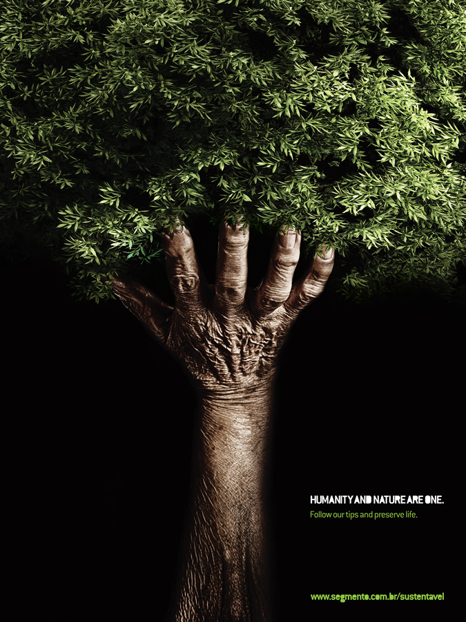
The image depicts a weathered human arm holding up some sort of vegetation in a completely black background. The representational images give the viewer something they can relate to visually and engages the viewer so that he or she can then think about the abstract aspects of the poster and the symbolic meaning behind it.

Abstract
The image uses the representational images of the arm and the plant to create a simplified tree. The tree is a simple and abstracted image that becomes a symbol because of what it represents. The black background can also be seen as an abstract element of the poster. It isolates the image and forces the viewer to focus on the arm holding the vegetation and consider it's meaning.

Symbolic
When broken down, the image can basically be seen in two parts, the plant and the arm. The arm represents humanity and the plant represents nature. The message of the image is that these two things are one and should coexist. The tree itself is a typical symbol used to represent nature. The symbolic nature of the abstract tree gives meaning to the arm and plant. It makes the image more than just a simple picture of an arm holding a plant, or a cool double image. It gives the image meaning.